
I have a handful of students who got some exciting new art supplies for Christmas! I'm happy to say I played a sneaky part in some of those, as I had parents texting me asking questions about supplies. :-D So I thought I'd share some painting exercises you can try as you get to know your paints! Having a solid grasp on the properties of each of your pigments can take you a long way. If you know what they do, you can select certain pigments for certain purposes!
Without further ado:
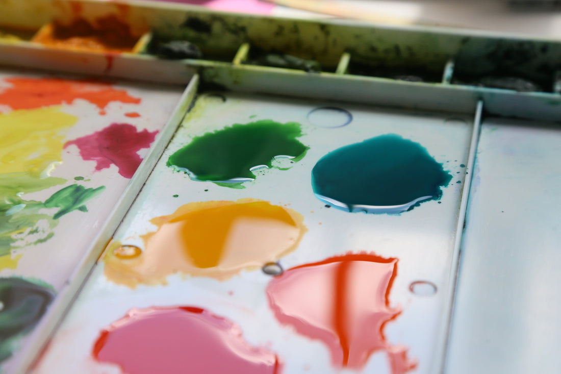
Get to know your own paints with these seven exercises!

Gradiated Color Swatch

The hardware store has paint chips, so why not you?? This should be the first thing you do when you get a new paint color! Get yourself a set of these puppies and soon you'll have so much rizz with your painting buddies, you won't know what to do.
Oh wait, that's right! You'll actually confidently forge ahead with your painting because you KNOW this color like your BFF.
I like to tear a 9x12 watercolor paper into strips the length of the paper and the width of my favorite ruler. Line up the edge of the paper with the ruler, then hold it tight and tear the paper into strips. It's much faster than cutting!
After that, punch a hole in the strips and secure it with a binder ring or twisty tie - or whatever you have. It doesn't have to be fancy. Also include the brand and name of the paint (at the very least). You might also include ther info you would find helpful, like paint pigment number(s) and transparency level. Whatever helps you get to know your colors!
Mine are sorted into color families: blue, reds, yellows, earth colors, greens, neutrals etc. This makes it easier to pull a color family and choose the right hue for the job.
Paint a swatch of each color that you have, even if it's not on your palette at the moment. You can pull these out and use them when you have to make decisions about what paints to put in a new painting.
If you also make your color swatch gradiated, you can see the wide range of value that you can acheive with that particular paint. It takes some practice but once you get the hang of it, gradiated washes like this are a lot of fun and a super useful skill to master. (Especially for beautiful and interesting skies!)
The set pictured is part of the basic color palette that I offer.
Colors on your palette

Paint the colors where they are in your palette. It can be fancy or more like plain squares. Just paint them so you know what colors you put in there!
Later on, if you decide to switch out a color, you can simply cut and paste the new color on top of your old one.
Color Transparency Chart
Draw a Sharpie line down one side of the paper. (Or paint black acrylic and let it dry.) Paint a thick swatch of paint on the line. Then paint a more diluted swatch next to it. Try to aim for a medium amount of dilution: somewhere in the middle range of your color swatches from earlier. Label the colors when it's completely dry.
Later, you can refer to this chart to get an idea of how transparent a color is. Some pigments are more dense than others, so you won't see the black Sharpie through the paint. This gives you a better idea of how much water you may need to use when working with that pigment. (Or in the case of acrylics, how many layers you may need to cover up something.)
This also usually ends up being a good indicator of how many fillers are in your paint brand! Chalky stuff that gets mixed in during manufacturing will really show itself with this exercise. It's like the MSG of the paint world: it fills your tube to make it cost less without actually providing a quality amount of the good stuff.
This particular chart is the one I made for my M. Graham gouaches, so they are way more opaque than watercolors.
Color Mixing Chart

It's the artist's multiplication table! No, for real. Put the names of the colors across the top and down the side. Then run one finger across a row, and one down from the top to see what those two colors make.
This was one of the first charts I made, and afterwards I realized I actually only needed half the chart because I was just repeating myself! You may have seen a multiplication table with a diagonal line dividing it, and one half of the chart below or above the diagonal is blank. That's because you'll always get the same answer for 5x4 as you would for 4x5. Spoiler alert: It's twenty! Always twenty no matter which order you do it in! So you don't really need it on there twice.
That said, sometimes it's super satisfying to fill in the whole chart. And it's good practice! Plus, you'll probably get some slight variations each time. So go for it if you want!
I recommend bigger squares rather than smaller. I like to use my favorite ruler (again) for the width. Just scooch that thing along, line it up with the previous line, and draw the next line in the row or column. You might not fit them all on one page this way, but it's easier to tape them together than to try to work in a tiny box.
I also like to give a little white space in between each one, and make sure the square next to it is totally dry before painting the next one.
Color Wheels

Make a color wheel - or two! I have one for warm and one for cool hues. This is something that can get a little complicated, but basically you need to know this:
We have "warm" colors like red, yellow, orange. (Think fire, summer, warmth) And we have "cool" colors, like blue, green, purple. (Think water, ice, grass, shadows.)
But within each of those colors are subcategories: There are "warm yellows" and "cool yellows." There are "warm blues" and "cool blues." There are "warm red" and "cool reds." And so on with premixed secondary colors.
There's actually some fun science to this if you want to check it out - no, it's not arbitrary artist-speak! But you can also search a question like "is [brand] [color name] warm or cool?" and usually get a fast answer from the manufacturer's website or an artist's forum.
If you get a grasp on the warm and cool versions of a color, you can have an easier time mixing. Often - but not always - a mix of warm and cool hue will result in a drab sort of color. Some of these can be quite pretty and useful as neutrals. But if you stick with mixing cool+cool and warm+warm, you'll end up with clean and bright mixes of color.
Color Gradient Swatch

Pick some colors, any two colors!
Great! Now put a clear coat of water on your paper. On one end, apply the first color. On the other end, apply the other color. Watch what happens where they mix in the middle!
Although you might be able to manage this on the color chart above, it's easier to do this on a longer swatch of paper so you can really see the variation you can get with certain color combinations.
I highly recommend doing this with all your yellows and blues, since you can find some incredible greens this way. I have never found a premixed green tube that I like. But I have discovered some gorgeous greens with this method!
Color mix flow chart

Speaking of greens. They don't always look the way we want them to, yeah? Often we get greens that are way too vibrant and need to be toned down a little. You can do this with any color, but green is a very useful one to start with!
First, pick a premixed green tube or your own green mix that you like. Paint a swatch of that green at the top. Then paint a row with a few colors that you want to try mixing into that green. Do the color mixing on your palette, then apply each mix in a swatch on the bottom row. That last row is the results of your experiment.
And now you know what it looks like when you mix that green with a little brown vs a little red, or what if you added more yellow vs more blue.
You probably can't see them, but I also added arrows and equal signs between the rows to show the relationship. Aw, it's like a family tree. How cute.
I hope that gave you a TON to do! As always, feel free to ask me any questions about supplies. You can also check out my supply FAQ page here for more specifics on recommended brands.
And if you want to REALLY gain confidence in what you're painting, book private watercolor or acrylic painting lessons with me. You'll get a TON more knowledge not even included in this blog. I absolutely love to see my students' eyes light up when something finally clicks and they go home full of inspiration and knowledge for their own art journey.
Now, get busy painting!!